Take a deep breath. It’s going to be OK. Really.
The National Incident Management System (NIMS) gives us the definition of an Emergency Operations Center (EOC) as “locations where staff from multiple agencies typically come together to address imminent threats and hazards and to provide coordinated support to incident command, on-scene personnel, and/or other EOCs.”
I’ll agree with this, but I’ll also suggest this isn’t a complete definition.
EOCs are really about building a bridge between emergency needs and our daily bureaucracy. In the context of response, we have a given set of agencies and organizations, such as first responders and others, that operate in that arena almost exclusively. Their bureaucracies are actually built around their response missions. They are generally built for speed and are supported by procedures and policies to support this. But during a large emergency or disaster, the needs of the incident exceed the capabilities of these response forces, requiring other, less traditional, agencies and organizations to not only provide support, but services as well. While we have seen an increase in these ‘non-traditional’ responders becoming involved, it doesn’t occur with enough frequency to make it a standard of practice. Rather, the focus in these agencies and organizations is still their daily missions, of which the vast majority is not disaster related. Their bureaucracies are built for the day-to-day, not for speed. This is all OK. Bureaucracy isn’t a four-letter word, but in the world of emergency and disaster management we need to understand why certain bureaucracies are built the way they are and figure out how to flex them to shorten reaction time.
Enter the EOC – a room (physical, virtual, in hybrid) where the intent is for bureaucracy and speed to awkwardly coexist. While our traditional response agencies and their counterparts (often at higher levels of government) will always be needed to contribute, the EOC isn’t built just for them. The EOC is also built for those who don’t respond with lights and sirens, but are just as important to supporting our communities during times of disaster.
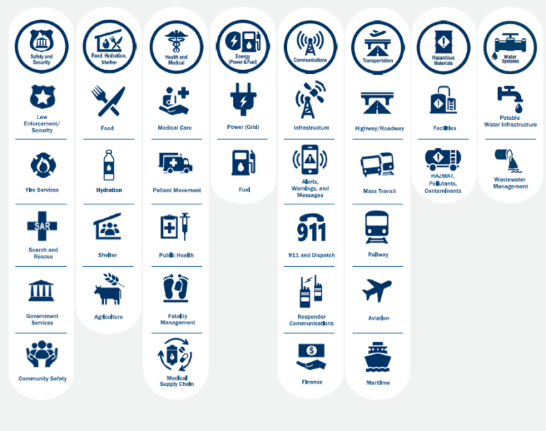
We need to consider that disasters offer extraordinary circumstances with problems that can’t be solved by traditional means. We need to be creative. We also need to recognize how interconnected all facets of our community lifelines are. In order to conquer the extraordinary, we need everyone. We need to identify the capabilities and capacities held by agencies and organizations we might not typically see involved in an incident. Take a look through the list of departments your own city, village, or county has. The Clerk’s Office? The Planning Department? The Purchasing Department? The Office for Mental Health? The IT Department? Office for the Aging? Child and Family Services? Human Resources? Weights and Measures? There are so many more.
The intent of the EOC is to bring together representatives of these agencies and organizations to help streamline their assistance and support. The EOC should cut the proverbial red tape, but key to that is ensuring that each organization is properly represented. With no disrespect intended toward middle managers, as they often are the ones who really run an organization, EOCs require representation from executive-level leadership of these agencies and organizations. The EOC needs the people who have authority to cut through red tape when required.
So how do we approach this in emergency management: APOETE.
Assessing – Seek first to understand. Identify what agencies and organizations may be needed and when. What do they have? What can they do? What are their limitations?
Planning – Integrate them into emergency planning and encourage them to develop their own emergency plans that address they can work within their own bureaucracies.
Organizing – Meet with them and meet collectively. Bring representatives onto working groups that work in preparedness, response, and/or recovery (consider the Community Lifelines as a place to start). This promotes mutual understanding and inclusiveness.
Equipping and Systems – Ensure that all partners have access to the systems used to support incident management.
Training and Exercises – Broaden the invite lists for training and exercises to help these partners gain knowledge and become more involved.
In the end, it’s about working together toward a common cause, aka unity of effort. To maximize the utility of our EOCs, we need to stop looking at an EOC through the lens of the first responder. Flip that perspective and begin looking at the EOC through the lens of government bureaucracy. Consider what these partners need to be successful. How and when can we streamline? Don’t try to turn them into first responders – that’s the wrong expectation. Rather, we need to meet them where they are, respect what they do, and understand why they have certain protocols in place. That will give us a foundation of understanding to work from.
End note: I’ll also suggest that this reality is another reason why ICS-based organizational models for EOCs are less than effective. The organization of an EOC needs to serve a different purpose than what we often try to force it into. Check out the Incident Support Model as a great alternative.
© 2025 Tim Riecker, CEDP